The patient info dashboard is designed to reduce the data collection time for the radiation therapy medical team doctors.
Timeline:
Apr.2022 - July.2022
My Role:
UX UI design
Design strategy
User research
Client:
Memorial Sloan Kettering Cancer Center
Deliverables:
IA
User Flow
Wireframes
Prototyping
Annotated Mockups
CURRENT SITUATION
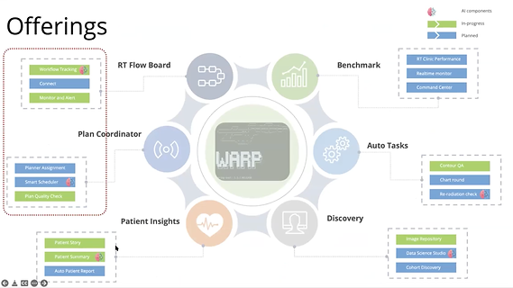
The WARP system is redesigned to help implement workflows and track patients through the treatment process in the radiation oncology department. The patient info dashboard is part of the redesign project.
Right now, data on radiation therapy patients are scattered on different platforms or software in the cancer center.
PROBLEM
The usual time for doctors to find patient data from every platform or software will be around 30 mins or more.
OPPORTUNITIES
An all-in-one dashboard that structures the information with a new hierarchy and thereby allows each role in the RT medical team could see the most important information they care about at the first glance.
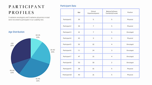
User Data
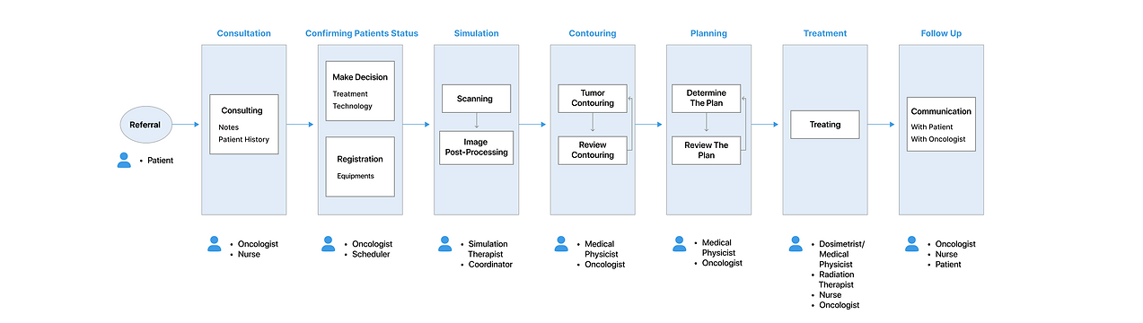
After diving deeper into the problem, I realized it was more complicated than I expected. There are six different roles in the RT medical team, which are radiation oncologist, physicist, dosimetrist, therapist, coordinator, and nurse. They all have different ways to approach the dashboard. Here I summarized four key roles in the medical team.
For Radiation Oncologists, they will develop the treatment plan and oversee the entire radiation therapy treatment process.
SCENARIOS WITH DASHBOARD
-
Collect and review longitudinal patient records and decide if RT benefits the patient.
-
Review treatment goals, risks, and expected visits.
-
Discuss and confirm the treatment plan with the radiation physicist.
-
Contour the exact location of the tumor.
-
Discuss if the radiation therapist finds a problem conducting the treatment.
For Radiation Physicists, they will determine the ideal radiation doses.
SCENARIOS WITH DASHBOARD
-
Discuss the treatment plan with the radiation oncologist.
-
Review longitudinal patient history.
-
Compute the ideal radiation dose.
For Radiation Dosimetrists, they will explore the side effects after conducting RT.
SCENARIOS WITH DASHBOARD
-
Discuss on delivering the highest dose possible with minimal side effects with the radiation physicist.
For Radiation Therapists, they will deliver the radiation dose prescribed by the radiation oncologist and physicist.
SCENARIOS WITH DASHBOARD
-
Review longitudinal patient history before performing treatment plans.
-
Communicate promptly with the person in charge when problems arise.
Workflow
Define Success
PAIN POINTS
USER GOALS
All Roles
Scattered Information in too many internal systems.
Too many clicks.
Buzy UI lead to eyestrain.
Can't trust information due to delay or mistakes.
Radiation Oncologist, Physicist, and Dosimetrist
No longitudinal patient history are available.
No historical treatment plans are available.
Radiation Therapist
Can't quickly locate the most recent treatment plan.
Can't contact the oncologist in charge promptly.
Nurse and Coordinator
Don't know what assistance the patient might need.
2.
Hard to manage multiple patients.
1.
I can find all the information I need in one dashboard.(1a)
I want to find the information with fewer clicks as possible.(1b)
I would like an eye-friendly UI, nice to have one work in dark rooms.(1c)
I need to ensure the data is accurate and in real-time before I use it.(1d)
I need to drill into the longitudinal treatment schedule.(2a)
I need to view historical treatment plans.(2b)
I need to be able to switch among different patients.(2c)
3.
I need to find the most recent treatment plan quickly.(3a)
I need to find the oncologist in charge in no time.(3b)
4.
I need to learn the patient's special conditions before the patient arrives.
DESIGN PRINCIPLES
PRODUCT REQUIREMENTS
SUCCESS METRICS
Consider every use case.
Significantly cut down time in exploring patient information for all roles in the RT medical team.
Efficient
Decrease Time-on-Task.
(Tasks should be specific to different roles)
Let the user find a solution by themselves.
Make both the longitudinal patient schedule and current treatment plans presented on the dashboard to empower clinical decisions.
Easy to use
Increase Ease of Use Rating in looking up patient info.
Create a hierarchy of choices. Present default status.
Summary the patient current status, but it could also be used to drill into the details if the medical team would like to see more.
Useful
Increase the Task Success Rate
(Tasks should be specific to different roles)
Structure IA
PROBLEM CONTEXT
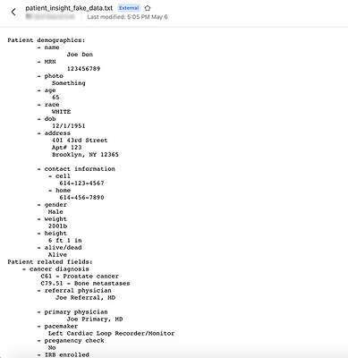
Fake Data
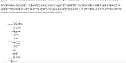
To learn about the data fields and to estimate the space each field should have. We asked for fake data from the backend engineers, which are the fields our client would like to include on the dashboard.
GOAL
Structure the data into a map according to:
-
the meaning of each field
-
the space needed for each field
-
the needs and working habits of each role in the medical team
CRITERIA
What info needs to be surfaced at first glance?
What needs to be drilled down to be seen?
What actions users may take after seeing the info?
SOLUTION
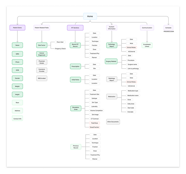
Click to see details 👆
DECISION 1
Prioritize the "RT Report Section" and establish assistant sections.
-
Previous, and recent treatment records, prescriptions, simulation orders, and initial notes are the most important and necessary to consider for radiation oncologists and physicists to make a medical judgment.
-
While other info, such as a series of reports, is subsidiary info.
DECISION 2
Carve out space for more patient critical info despite basic patient demographics.
-
Did research regarding risk factors for RT patients, info such as a pacemaker, pregnancy status, COVID situation, and disabilities should be considered.
-
Legally binding protocols and insurance providers need to be indicated.
-
The designated physician for the patient should be specified as a radiation therapist, nurse, and coordinator might need.
Design
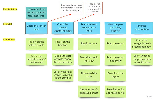
Distill Epics into Stories
After defining the information architecture and user workflow, I used the high-level user story to define the high-level task and epics. Then I broke down epics into multiple, smaller user stories and tasks for the key features.
User Story 1
I am taking over this new patient. I want to learn about his/her general treatment information in a couple of minutes.
FEATURE 1
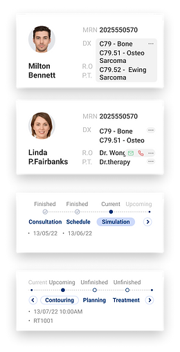
Patient Card Component
Types of Cancer Good Default &
Treatment Stage Timeline Good Default
(User Goal 2a, 3b)
FEATURE 2
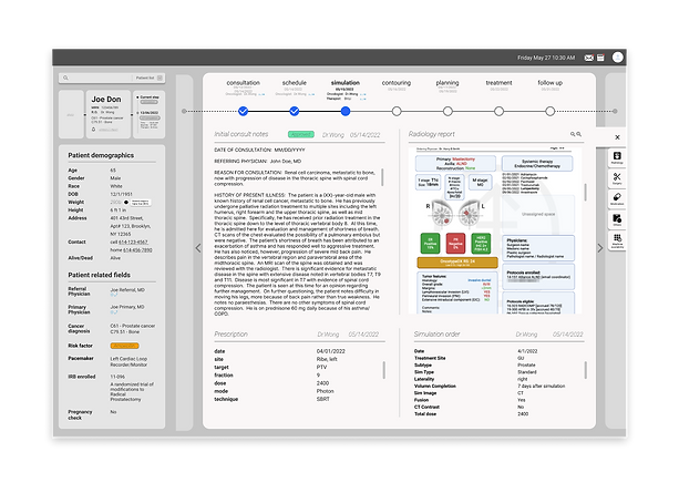
Center Stage for Reading Content + Module Tabs for Switching
Center Stage❶, Module Tabs❷, Report Status Indicator❸, Prescription Status Indicator❹
(User Goal 2b, 3a, 1d)
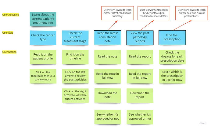
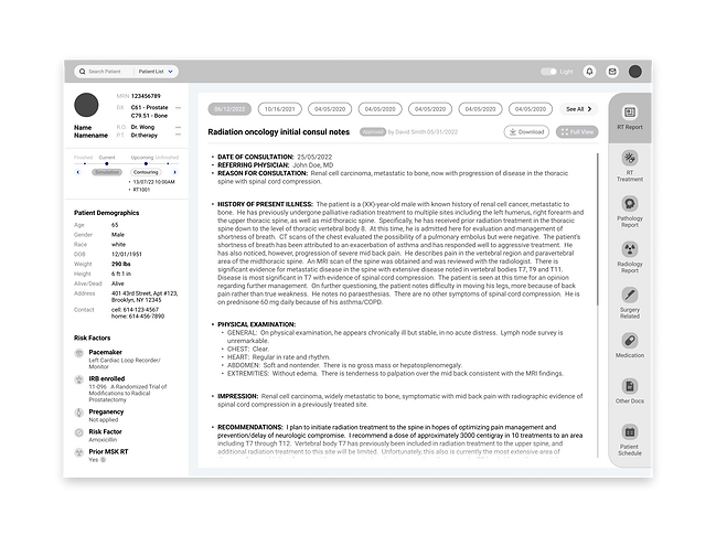
-
RT Report in Structured Data Format
-
Full View
-
Dark Mode
(user goal 1c)
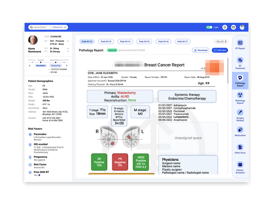
Pathology Report in
PDF Format
Slide to view:

Medication &
Prescription
User Story 2
I am checking on incoming patients for this week.
FEATURE 3
Patient List
Collapsible Panels(User Goal 2c)
When any role in the medical team need to switch patients quickly, or when they are preparing for next week's work, a collapsible panel of patient list will be useful.
WHY THIS PATTERN
The Center Stage content needs to take visual priority, so we put module of secondary patient list into panels that can be opened or closed freely by the user.

How I got there
CHALLENGE
HMW caters to the working habits of our target users?
EXPLORATION
1
Page-like Design
Side by Side View

2
Floating Tool Bar
Page-like Design
Side by Side View
Floating Tool Bar
IDEA
-
Intuitive to switch to each different treatment like turning pages.
-
We got insight from the interview that oncologists and physicists would like to compare reports when reading, so we made it into a side-by-side view for comparison.
WHY REJECTED
Although it's innovative and makes each treatment into a complete story on each page, according to our team's front-end engineer:
-
It's not feasible to implement.
-
The structured data can't fit perfectly in this layout.
IDEA
-
We researched other medical software our target users are used to in their daily workflow, we found that the pattern of a floating toolbar is very common.
-
Utilize doctors' habituation, and let them become expert users of our dashboard, which would also improve efficiency.
WHY REJECTED
We did a usability test on these two versions(with or without a floating toolbar) on 20 oncologists. The result reveals:
-
85% of the users found the fixed toolbox is quicker to access than the floating one.
* All 20 doctors were given this task, and 17 doctors had quicker actions by using the fixed toolbox.
* Time-on-Task was calculated for this task.
Therefore, we abandoned this solution.
3
Module Tabs
Center Stage
Chosen Solution
IDEA
We did two sets of interviews (each lasted 60 min+) for deeper insights and rethought each role's working flow in a user journey map.

User Journey
KEY FINDINGS
-
Radiation oncologists, physicists, and dosimetrists are key roles in the RT medical team.
-
These 3 roles would spend the majority of their time reading RT reports or prescriptions in their daily job.
-
These 3 roles would constantly switch to historical treatment records to assist their contemplation on a treatment plan.
-
All the roles in the medical team prefer switching tabs than opening up windows.
WHY ACCEPTED
Therefore, we arrived at the answer:
(1) Elevate RT sections with the consulting notes to the top priority over other reports/sections.
Pattern Used: Center Stage
This design would guide the user's eyes immediately to the most important task rather than have them wandering over the page in confusion.
(2) Use module tabs to help doctors to view historical treatment records.
Pattern Used: Module Tabs
The short and intuitive tab titles classify treatment reports or prescriptions into dates/IDs. This design is a very effective technique for decluttering and interface by grouping and hiding chunks of content.
Validation
USER GOALS
1. All Roles
I can find all the information I need in one dashboard.(1a)
I want to find the information with fewer clicks as possible.(1b)
I would like an eye-friendly UI, nice to have one work in dark rooms.(1c)
I need to ensure the data is accurate and in real-time before I use it.(1d)
2. Radiation Oncologist, Physicist, and Dosimetrist
I need to drill into the longitudinal treatment schedule.(2a)
I need to view historical treatment plans.(2b)
I need to be able to switch among different patients.(2c)
3. Radiation Therapist
I need to find the most recent treatment plan quickly.(3a)
I need to find the oncologist in charge in no time.(3b)
4. Nurse and Coordinator
I need to learn the patient's special conditions before the patient arrives.
SOLUTION
All information has been integrated into one dashboard.
No need to open a single new window in our dashboard.
Dark Mode is available now, UI is modernized.
Information trust could be built by checking on the status indicators.
Schedule timeline with Good Defaults could be drilled down.
Module tabs enable users to switch historical treatments.
Collapsible Patient List.
Center Stage for the RT treatment section.
The oncologist in charge could be easily found on the patient's card.
Risk Factors are specified on the left bar.
PRODUCT REQUIREMENTS
Significantly cut down time in exploring patient information for all roles in the RT medical team.
SUCESS METRICS
Efficient
Decrease Time-on-Task.
(Tasks should be specific to different roles)
Make both the longitudinal patient schedule and current treatment plans presented on the dashboard to empower clinical decisions.
Easy to use
Increase Ease of Use Rating in looking up patient info.
Summary the patient current status, but it could also be used to drill into the details if the medical team would like to see more.
Useful
Increase the Task Success Rate
(Tasks should be specific to different roles)
RESULTS
Previous: Avg. Time-on-Task for oncologists and physicists to finish looking up a patient's info: 30 min+
Now: Avg. 2-3 min
CLICK TO SEE DETAILS
According to the System Usability Scale (SUS) survey that we sent to all the roles in the RT dept., among 36 respondents, the result is 90.2.
We tested radiation oncologists, physicists, dosimetrist, and therapists for different tasks specific to their roles, the Avg. Task Success Rate are 96.7%, 96.2%, 98.6%, 97.2% respectively.
CLICK TO SEE DETAILS


Usability Docs Preview
Reflection
Takeaways
01 Learn to look for a breakthrough from ambiguity.
There were three kinds of situations in the face of feedback in the process of this cooperation with our client. The first one is that there was too much feedback from our client side. The second one is that the feedback was not unified among several members of the RT care team. The third one is that the needs of our client were not specific enough. Facing these situations, my team members and I learned to analyze the actual situation and needs of different doctors, and not just sacrifice the user experience of the design to fulfill the needs of the client. We filtered out the most important requirements and tried to complete the small features while the big ones were completed.
02 Learn to consider the technical feasibility.
In a section that requires showcase files, the information format that patients transfer to our system from other hospitals is not in the same format as the client hospital's format. We expected to have the engineers extract the text information from these other hospitals' files and edit it into our client hospital's format in order to keep them in a consistent and aesthetically pleasing way. However, this required the use of expensive natural language processing(NLP) technology, and the feedback we received from the engineers was that this NLP technology was likely to be immature, resulting in a lack of accuracy in the extracted text and a wrong medical diagnosis. So we learned that we needed to consider the level of completion and difficulty of implementing this feature from a technical perspective.
Next Steps
01 Consider the integration with other parts of the product.
Since the patient insight dashboard is only a small part of the main product, we need to continue to improve the current design. The main changes needed are the visual style and the unification with the main product, as well as the APIs with the main product.
02 Remeasure the outcome of our design after launching
The product is currently developing. By the end of this year, we will likely measure the Task Success Rate, Time-on-Task, and User Error Rate by the first BETA launch. By then, the data we get will gear us to further improve our product's features.
Thanks for making it to the end!
💐
#UX RESEARCH #UX: EHR
Clinical Inbox:
Out-of-Office Functionality
Led the research and MVP design for the Out-of-Office functionality within the clinical inbox of athenaOne, enhancing the awareness and visibility of clinicians' Out-of-Office status across all touchpoints within athenahealth product ecosystem.